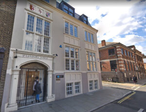
Just up the road in Union Street SE1 is the headquarters of United St Saviour’s Charity (‘UStSC’), who recently commissioned Southside Print to produce two A5 landscape booklets. Both were printed in full colour on our digital presses here in Tabard Street. They were printed on 200gsm Lumi Silk paper, a high quality coated stock with a significant thickness to give the booklets substance and a feel of real quality. 100 were produced for one booklet and 500 for the other, suiting our digital printing service perfectly — those modest quantities simply would not have been economically viable using a traditional litho printing service.
The first booklet was a twelve page publication called “The Value of Small Grants”. It represented a review of the impact of grants issued in South London by both UStSC and Peter Minet Trust.
The second booklet was called “Where to look for grants and funding”. This was a guide to help groups in Southwark find funding for their local activities. The cover of each booklet can be seen above in the main image.
Southside Print also produced 1000 A5 leaflets, which promoted a community open day, along with some A4 leaflets (not shown).
About United St Saviour’s Charity, SE1
United St Saviour’s Charity is based in an attractive period building in Union Street SE1, just a short walk from London Bridge and Borough stations. They focus on uniting people and charitable organisations in north Southwark. Part of this includes the provision of two community grant programmes along with high quality sheltered housing for older people in the area.
Grant Programmes
Their open grant initiatives include the Community Investment Programme for large grants and the Community Engagement Programme for smaller grants. Both aim to strengthen communities in north Southwark, improve the lives of older residents in the area and level the playing field for those who may be experiencing social and economic disadvantage. North Southwark is very much ‘a tale of two Southwarks’ where one part of the population is benefiting from the recent growth and regeneration of the area while others simply struggle to make ends meet. In the last twelve months, the charity has invested £1 million into local projects and activities that are now helping to redress this imbalance.
Sheltered Housing
The sheltered housing element of UStSC’s work takes the form of two schemes; St Saviour’s Court, which provides 53 modern homes in Purley, and Hopton Gardens Almshouses, which provide twenty flats and Grade II period cottages in Hopton Street, SE1. Both schemes include 24 hour support services for the residents. To be eligible, applicants need to have worked in Southwark for at least 3 years before application, they must be 65 or older, have low income and capital and be able to live independently with help from carers if necessary.
The charity is also planning a brand new modern almshouse in Southwark Park Road in Bermondsey. It is currently in preliminary talks with the developer Delancey and architects Witherford Watson Mann and their shared vision for the new building is one of stunning quality and beauty. As well as providing modern, independent sheltered housing for older residents with limited income, the aim is also to provide benefits to the wider community.
Investment Properties
As well as the sheltered housing, the charity owns several historic investment properties and land in the area. Rental income generated from these helps to fund the charity’s work. Properties include houses, shops and even some SE1 pubs; for example the Wheatsheaf and the Market Porter in Stoney Street, near Borough Market, and Simon the Tanner pub in Long Lane.
You can contact United St Saviour’s Charity at St Saviour’s House, 39-41 Union Street, London, SE1 1SD. For further information, telephone 020 7089 9014 or visit their website at www.ustsc.org.uk
Your Digital Printer for Booklets, Brochures & More
Brochures are a priceless marketing tool for just about any business or organisation. Akin to a mini shop window or store front they will work hard to silently market your product or service to your target market, especially if written, designed and printed well. That’s helped still further if they also include professionally generated photographs or illustrations to showcase your products or services in the best possible light. With a well executed brochure, all your key sales and marketing information will be available anywhere, all distilled down in a handy, portable format. Unlike a physical store, they can be perused at your prospect’s leisure, whether mailed in the post, distributed from dispensers, left at coffee tables and receptions or handed out face-to-face.
Brochure Formats
Typical brochure formats include:
standard ‘saddle-stitched’ brochures;
wiro-bound brochures;
perfect bound brochures;
hybrid brochures e.g. that may have extra fold-out sections;
brochures that double up as folders, for example with pockets for inserts at the front or back.
Shapes & Sizes
Most brochures are based upon the ‘A’ sized paper sizes, for example A4, A5 and A6 etc. Such sizes can be presented in portrait or landscape mode, although portrait format tends to be most common as it’s more cost-effective to produce due to the way it uses standard stock sizes (less waste).
Aside from the standard ‘A’ sizes, there are also a few other brochure shapes that are quite effective, including:
Square brochures (typical sizes include 210mm square and 148.5mm square) — these have a certain charm about them;
6-page format (like a wide gate fold);
‘DL’ sized mini brochures (most often portrait in format, being H210mm x W99mm, which is easily accomplished simply by folding an A4 sheet into three).
Each of these sizes and formats will give your brochure a different feel which will, in turn, affect that all important first impression — important because your brand, product and service are all at stake. If your brochure looks poorly conceived and underwhelming, that is inevitably how your product, brand or service will also be perceived, so it’s important to take everything into consideration and to get it right.
Brochure Finishes
Lamination
Laminating the cover of your brochure will add a high quality, tactile feel to it as well as giving the brochure extra protection and some resistance to water. Lamination options include matt laminate, gloss laminate and ‘soft touch’ laminate. Matt lamination gives brochures a lovely soft feel and slightly mutes the contrast of images and colours. Soft-touch lamination is very similar in appearance but has a softer, almost slightly rubbery feel to the touch. Gloss lamination adds a rich shine to your brochures and really lifts the printed imagery — colours tend to look more punchy and are more saturated — however the final choice of which lamination style to use comes down to personal preference as well as suitability to the design and colour scheme that’s featured in your particular brochure.
Southside Print has in-house lamination facilities, so do ask us more about the various options available. We can show you samples so that you can see the differences yourself, perhaps before finalising the specification of your own brochure.
Coated paper surfaces
Of course, you could forget lamination completely (particularly if you’re wishing to save as much money as possible) and instead rely on the paper surface to do the work in respect of the surface finish. We can print on matt coated paper, gloss coated paper (not as glossy as lamination but it does have a definite sheen) and silk coated stocks. Silk coated paper is a nice halfway house between matt and gloss, having a pleasant, high quality feel about it.
Uncoated paper surfaces
Alternatively, brochures can be printed on uncoated papers or card weights and these look more muted, with lower contrast, but can give the finished brochure a nice contemporary look and feel. It all depends upon what the brochure is for and what kind of design your brochure features. While B2B brochures might typically use gloss, silk or matt coated papers, B2C organisations that want a more natural, ‘outdoorsy’ or earthy feel might go with uncoated paper stocks (or certainly stocks that look like they’re uncoated — technically speaking, a completely hidden coating can actually benefit the print quality and colours as it stops the ink being sucked up into the uncoated fibres, which might otherwise look too flat in terms of contrast and detail).
Foil blocking
Foil blocking your brochures, perhaps only for small details like a logo or title on the cover, can add a real feel of quality. Available in metallic colours of gold, silver, gunmetal, copper and many others, metallic foil really sets your brochures apart from the competition.
Examples
Click the thumbnail images (right) to see a few examples of brochures that we’ve recently produced for customers right across London and the UK. Most are printed in full colour with some being litho printed and others being digitally printed. You can also spot several examples of the various binding methods that we mention above, including saddle-stitched binding, wiro binding and perfect binding. Take a look.
Brochure printing in London Bridge, Borough and SE1
If you require any brochure or booklet printing or design, call Southside Print on 020 7378 6754, send us a message here, request a quotation here or upload your finished artwork here — we’ll be more than happy to make your brochure printing look every bit the part, without costing the Earth. With our high quality digital and litho printing, in-house lamination facilities and state-of-the-art printing presses, you’ll get the very best quality, competitive pricing and the fastest turnaround times available in London SE1. Give us a try — quotations and advice are totally free!
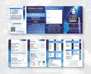
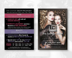
London Bridge recently undertook some stunning graphic design, artwork and printing work for The Lounge Hair & Beauty Salon in London’s SE16. Work included:
Double-sided business cards which were litho printed in full colour onto 450gsm silk coated card then finished with a matt lamination.
Price lists which were digitally printed in full colour onto a 250gsm silk coated stock and scored for folding.
A6 leaflets which were digitally printed in full colour onto a 250gsm silk stock and finished with a matt lamination.
Large format posters which were printed onto a 190gsm photo satin stock and encapsulated with a matt finish.
In-house Design & Printing Services
All design and artwork was produced by Southside Print London Bridge’s Matt Potter. Customers of Southside Print London Bridge benefit from in-house, high quality graphic design and artwork services as well as digital print services, a litho printing service and even large format printing facilities. So we can produced design and printing whether it’s for a business card at one end of the scale, large display graphics and exhibition systems at the other … or anything in between including, of course, brochures, leaflets, catalogues, newsletters, stationery and so on. We should also mention that photocopying & duplication is another popular service which is available from Southside Print’s SE1 branch.
About The Lounge Salon
The Lounge Hair & Beauty Salon specialises in a wide range of hair and beauty services in a warm and relaxing atmosphere. Staff listen carefully to clients’ requirements, offer expert advice and achieve the very best style, colour and outcome to suit each individual customer perfectly. The salon has a 5-Star rating in the Good Salon Guide, which is a real testament to the highly skilled and personable team, and is often featured in prestigious hair magazines. All services are under one roof and cater for both women and men. Customers are even offered a glass of wine which is a great way to relax and de-stress while the staff work their magic.
The Lounge Hair & Beauty Salon, established in 2000, is located in Jamaica Road in the City of London close to Canary Wharf and is just a stone’s throw from Bermondsey tube station (Jubilee line). They have a private car park which caters exclusively for their clients and are on bus routes 1, 47, 188, 199, 255, 381, C10 and P12. Product ranges used within the salon include L’Oreal, Redken and Dermalogica among others. The salon is open 7 days a week, including late opening to 8pm from Tuesday to Friday inclusive, and on Sunday from 10.00am – 5.00pm.
Special Hair & Beauty Offers for December!
Get a £10 Gift Voucher when you spend over £45 on hair and beauty services at the Salon between 1st and 31st December 2015. (To be redeemed Monday to Thursday only).
Also check out the salon’s regular special offers and packages on their blog.
Lastly, with the party season fast approaching, why not book into the Salon for your PARTY HAIR!
For further information
The Lounge Hair & Beauty Salon
200 Jamaica Rd, London SE16 4RT
T: 020 7237 2624 www.loungehairbeauty.co.uk
Printing & Design Services, SE1
Meanwhile, of course, for any design and printing related enquiries, Southside Print London Bridge welcomes yourcall on 020 7378 6754 or contact us here and we’d be delighted to supply a quotation for your next job, or chat through your requirements, without obligation.
Have you ever seen a super-glossy brochure and wondered whether it’s gloss laminated … or perhaps gloss U.V. varnished? Even printing experts have trouble spotting the difference! To all intents and purposes, they look the same, but their production methods, costs and properties are very different.
Lamination
Lamination is a process whereby a thin, transparent, plastic film is bonded, under pressure, to the surface of your printed paper or card. The plastic film can have a variety of finishes including high gloss, soft-touch and matt.
Gloss lamination adds an incredible shine to documents and tends to enrich printed colours, also giving photos a greater depth due to the extra contrast they lend them.
Matt lamination gives printed documents a lower contrast and, as such, tends to give them a contemporary, lighter appearance along with a high quality look and feel.
Soft-touch lamination is similar in appearance to matt lamination but has a softer, more tactile feel to the touch. Some describe it as velvety, others suggest that it’s perhaps even a little rubbery in feel … but in a good way!
Either way, once laminated, the printed sheets are cut and finished so that the edge of the printed sheet is an exact match to the edge of the bonded lamination, with no difference or overhang of either. Lamination can be applied to one side of the sheet, or both.
Lamination gives the printed job additional protection against wear and tear. In fact, one way to be sure that a printed document is laminated is to try to tear it. If it’s nigh on impossible to tear, chances are it’s laminated. Lamination also gives documents protection against moisture, simply due to the presence of the plastic film that’s bonded to the surface.
Lamination is suitable for even reasonably high quantities of printing because it’s a high speed, mostly automated process. It’s used for protection, to give printed documents a lovely finish and to give them a feeling of high quality.
Encapsulation
Encapsulation is similar to lamination but the plastic film tends to be significantly thicker and is applied to both sides of the printed sheet. Uniquely with encapsulation, the plastic covering protrudes a few millimetres beyond the edge of the underlying printed sheet and indeed the plastic on the front and the plastic on the back bond to each other where they meet. This forms a tough ‘frame’ of thicker plastic around the edge of the printed sheet.
As with lamination, encapsulation protects the printed sheet from wear and tear and from moisture, however even more so than lamination due to the greater thickness of the plastic and the edges of the sheet also being protected by a double thickness of heat-bonded plastic.
Encapsulation is usually used for one-off or low quantity printing because it’s relatively expensive and time-consuming compared to lamination. It’s ideally suited to printed items that perhaps need to be displayed, manhandled regularly or used in environments that might otherwise lead to the printed item becoming dog-eared or spoiled by water ingress. Menus would be a good example.
U.V. Varnish
U.V. varnish is almost always encountered in a high gloss finish. However, it is also available in matt finish although that’s rarely seen. To even a trained eye, an overall gloss U.V. varnish looks almost identical to gloss lamination, giving the printed document a high gloss sheen that enriches the saturation of printed colours and gives photographs a deeper contrast and ‘punch’. However, the U.V. varnishing process is remarkably different to that of lamination. Unlike with lamination, the gloss sheen is actually printed to the surface of the paper and this then passes under a heat lamp to set it into its robust, high gloss finish.
Unlike lamination, documents that have been U.V. varnished can be torn quite easily. This is the main way to tell gloss U.V. varnished documents apart from those that have been gloss laminated.
However, because it’s printed with a liquid varnish, there is another major advantage to U.V. varnishing. That’s the fact that it can be used to ‘spot print’ the varnish. You could U.V. varnish only the logo and photos in a document while leaving the remainder of the background unvarnished, for example. That’s simply not possible with lamination or encapsulation because, with both of those, the finish has to cover every millimetre of the sheet. That’s a huge difference and is another easy way to tell whether something is spot U.V. varnished or gloss laminated.
For extremely high volumes of printing, overall U.V. varnish can work out cheaper than lamination. For this reason, you will often find that glossy magazines are actually U.V. varnished rather than being gloss laminated. It’s also worth noting that, because there is no plastic film used, U.V. varnished documents and magazines are easier to recycle than those that have been laminated.
Machine Varnish
Then there’s matt, silk or gloss machine varnish (of the non-U.V. kind) although those options are only possible on a litho printing presses. Machine varnishes tend to be much more subtle than lamination, encapsulation and U.V. varnish. For example gloss machine varnish is nowhere near as glossy as gloss lamination, encapsulation or U.V. varnish, so is easy to tell apart from them. As you can see in the middle example on the main image, gloss machine varnish gives printed documents more of a ‘sheen’ in reality (not a high gloss). It is used less and less these days, not least due to the recent proliferation and vast improvements in the quality of digital printing.
Not Sure Which to Use?
With so many options available it can be confusing knowing which process is going to be the most suitable and affordable for a particular print job. We can help, though! Southside Print has the know-how and equipment to produce pretty much any finish you like and we can let you know when one process will be more suitable than another. Cost comes into it too, of course, because some processes are more suitable for low print runs and others are more suitable for high volume work. We can advise which process will give you the optimum balance for a high quality look and feel as well as representing good value for money. Call us on 020 7378 6754, email us us message here or, alternatively, request a quotation here and we’ll come back to you by return. Our quotes are free and without pressure or obligation. As well as printing and production, we also offer a design and artwork service, by the way. Click the bold links for more details.
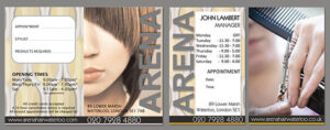
Arena Hair, Waterloo, wanted to update their price lists so Southside Print London Bridge printed new cards for them with prices on one side and an appointment booking area on the other. They also needed individual Hairdresser cards with their salon times. These feature a lovely matt laminated finish and a smart new design. They were digitally printed on White Essential Silk stock, 250gsm, and a quantity of 250 was produced of each kind.
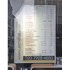
As well as the cards, Southside Print also produced a backlit ‘lightbox’ price panel which, as you can see, is featured as part of Arena’s shop front display. We also produced a framed version for them to display on their wall inside the salon. This is all part of Southside Print’s large format printing and display service — we don’t only do digital and litho printing.
Arena’s reputation for innovative cuts, excellent service and unmatched colour work is unbeaten. The salon is fully air-conditioned and the complimentary refreshments on offer to customers even include wine. Arena are currently updating the photos on their website, particularly for the team members (Nigel Hillier is the photographer involved and he produced the large photo right at the top of this article as well as the shop front photo shown further down on the right). Arena Hair are just a stone’s throw from Southside Print London Bridge, over in Lower Marsh, Waterloo SE1. Call them for a hair appointment on 020 7928 4880 or visit the website at arenahairwaterloo.com. You can also keep track of them on their interesting and unusually busy Twitter account: twitter.com/arenahair.
If you need any fast-turnaround, short run digital printing, litho printing for larger quantities and more specialised printing specifications, or large format printing and display work for in-store displays or trade exhibitions, give Southside Print London Bridge a call on 020 7378 6754 or see our Contact page for further options
Preparing your own design and artwork for professional litho or digital printing is quite a bit more involved than preparing jobs for in-house desk-top printing. There are several reasons for this but the main ones can be summarised as:
the professional printing industry, as you might expect, uses professional standard software, written in its own industry-standard language (PostScript) which is designed to give reliable, high quality results. Not everyone has this, or can afford it;
the resolution (density of image and graphics information) needed for digital and litho printing needs to be much higher than for desk-top prints;
the job needs to be handed over to your printer, a third party, in such a way that all graphics and fonts are somehow included in the file otherwise they might be absent or substituted in the final printed job!
Here are some guidelines to get over these, and other, artwork hurdles:
Use the right design & artwork software
Our first major tip would be to start off using professional design and artwork software. So rather than attempting your masterpiece with Microsoft Word or Powerpoint, you should really be using something like Adobe InDesign or Quark Express for the page layouts plus Adobe Illustrator and Photoshop respectively for any vector graphics and photographs. Of course other packages exist but those mentioned are pretty much the industry standard these days. If you do not have these packages, or the professional-level equivalent of them, then it might well be best to ask us to produce your design and artwork for you otherwise the files you supply might give you unexpected printing results.
Colour space
The colour mode for photographs would usually be set in Photoshop or its equivalent.
For ‘full colour’ work (e.g. including colour photographs) all images and graphics should be saved in CMYK mode rather than RGB (the latter is for screen and will print unreliably if you use it by mistake).
For ‘black and white’ jobs printed via the litho process (it’s not such an issue with digital), it goes without saying that all text should be made in a single ‘black’. No additional ‘spot blacks’ should be in the file’s colour palette otherwise you may accidentally use more than one black in your job and that could over-complicate the printing output requirements. Any tints should be tinted percentages of your single black. Any black and white photographs should be saved in greyscale mode.
For ‘spot colour’ work (destined to be litho printed) care needs to be take to confine all elements to your limited spot colour palettes, or tints of them. Preparation of photographs for use in spot colour jobs will vary from one artwork package to another so do ask us if you need guidance on an individual basis.
It is worth noting that the colour space for jobs destined for digital printing is a lot more forgiving then litho, should you get it wrong (and, of course, it’s quick and easy for us to output a single digital print for you to check before you commit to the full print run. That’s not so straight forward with litho).
Resolution
Resolution for all photographs and any ‘bitmapped’ graphics should be 300dpi (dots per inch, also known as PPI or pixels per inch). More is OK, within reason (you don’t want the file size to be too huge) but if you supply images at a resolution of less than 300dpi a point will be reached where you start to see pixels in the final printed output, which is a bad thing! This point is usually evident at resolutions below 150dpi or ppi. For this reason, images taken from websites (usually 72dpi) are not of sufficient quality unless, of course, they are vastly reduced in size (and the colour mode changed accordingly of course – see the Colour Space section above).
How about resolution for vector graphics? Well, that’s a trick question because vector graphics (produced by such packages as Adobe Illustrator) do not have a resolution; they are made from mathematical ‘vectors’ and as such can usually be scaled to any size without loss of clarity and sharpness. If prepared correctly and used in professional layout software packages like InDesign, they simply do not have any pixels or resolution to worry about. Do watch out for those colour modes though (see Colour Space section above).
Preparing your artwork file for handover
Outlining text:
In the ideal world you should convert all fonts to ‘vectors’ (or ‘outlines’ as they’re known in the graphic design and print industry). However, before doing this, make sure you save a back-up copy of the job when its text is still ‘live’ (editable) in case you subsequently spot an error and need to edit the text again. Outlining text means that you literally convert the text to those mathematical vectors mentioned above. Why? Because then we, your printer, do not need to have the same fonts as you, nor do they need to be embedded in the file (’embedding’ fonts is another good option but is not quite as reliable as outlining, although that does depend on which software package you are using).
In professional packages like Adobe Illustrator and Adobe InDesign, you outline text simply by selecting it with your pointer tool then choosing ‘Create Outlines’ from your ‘Type’ menu. A good way to test whether you have missed anything is to then go to ‘Find Font’ (also in the ‘Type’ menu) and see whether this handy tool finds any stray or unconverted live text – it’ll even show you where it is if you ask it to.
Embedding graphics:
In most professional design and layout (‘page make-up’) programmes, externally produced graphics such as photographs and vector graphics are brought into the layout, but are not incorporated in full into the actual file. They are usually only linked to, by default. This is an important factor to take note of because if you then try to supply your single artwork file to your litho or digital printer, without all the linked graphics, then the job will be full of spaces where the graphics and photos should have been. For this reason the very best option is to ’embed’ the graphics and photographs into the final, single, artwork file. In InDesign and other similar packages this is simply a case of either selecting each graphic one by one and then using the ’embed’ command (in InDesign and Illustrator this is on the Links palette) or, easier still, allow the graphics to be automatically embedded in one go by outputting the artwork as a repro-quality Acrobat PDF file (more about that below).
Making sure about bleed:
Make sure any images and graphical elements which you want printed to the very edge of the final printed job include an extra 3mm of ‘bleed’ (i.e. they extend outside the final cropped document area by that amount). This safeguards against inaccuracies in cutting and ‘page creep’ which occurs in multi-page magazines and books, for example, but let’s not get into detail on that other than to say you do need 3mm of extra bleed for any item printing to the edge of the final job — that is an industry-standard requirement.
Saving off a PDF
Once all your fonts have been outlined and all graphics, resolutions, colour spaces, bleed and so on have been carefully checked, you are ready to output your final ‘one piece’ artwork file. Some page make-up programmes have a ‘pre-flight’ checker which, as the name suggests, checks your set-up one last time before handover to your printer. Sometimes this can throw up small issues that you didn’t think to check or perhaps overlooked. When any such issues have been sorted out, you are ready to output your final repro-quality PDF file, the preferred file type in the printing industry.
Professional page make-up programmes like InDesign do this via the ‘Export’ command. Here you save off a new file (a repro-quality Acrobat PDF file) and carefully check the settings, screen by screen. It’s very important to get them right. For litho and digital printing, high-end packages like InDesign will have a pre-configured ‘Press Quality‘ setting which you can usually choose from a drop-down list when exporting. This will set most of the export settings correctly, however you might need to check a few. For example, for the ‘compatibility‘ setting we tend to stick with ‘Acrobat 4 (PDF 1.3)‘ which is backward compatible to be safe. The best PDF ‘standard‘ option to use is usually PDF/X-3, however if your job is litho with spot colour then use ‘PDF-X/1a‘ instead. Make sure you remember to add printers’ marks and 3mm bleed during the export configuration. For the ‘Colour’ setting set it as CMYK for full colour litho and digital printing or, if there are any spot colours, select ‘Leave unchanged‘ assuming you have set the colours up correctly as outlined earlier in this article. Always open up and carefully check your PDF before handing over to your printer. Zoom in on images and check that they are nice and clear without noticeable pixels when viewed at true size and even a little larger (within reason – pixels will show, of course, if you zoom in really close). Make sure there is bleed on appropriate graphics and images which extend to the document edge etc.
Don’t Forget:
When preparing your final print-ready PDF file:
Save your images in CMYK mode at 300dpi;
Add 3mm of bleed to your artwork, along with crop marks;
‘Flatten’ your artwork using the ‘Medium’ setting;
Save your file with ‘PDF/X’ and ‘Press Quality’ settings.
Southside Print in London Bridge can help you with all your printing and document duplication needs; we are litho printers, digital printers and large format printers and our SE1 location is perfect if you are looking for a printer close to locations like London Bridge, Borough, Bermondsey, Elephant & Castle, Waterloo and Southwark, just South of the River Thames. Contact us here for more information or a no-obligation quotation — we’d be delighted to help.
To provide the best experiences, we use technologies like cookies to store and/or access device information. Consenting to these technologies will allow us to process data such as browsing behavior or unique IDs on this site. Not consenting or withdrawing consent, may adversely affect certain features and functions.
Functional
Always active
The technical storage or access is strictly necessary for the legitimate purpose of enabling the use of a specific service explicitly requested by the subscriber or user, or for the sole purpose of carrying out the transmission of a communication over an electronic communications network.
Preferences
The technical storage or access is necessary for the legitimate purpose of storing preferences that are not requested by the subscriber or user.
Statistics
The technical storage or access that is used exclusively for statistical purposes.The technical storage or access that is used exclusively for anonymous statistical purposes. Without a subpoena, voluntary compliance on the part of your Internet Service Provider, or additional records from a third party, information stored or retrieved for this purpose alone cannot usually be used to identify you.
Marketing
The technical storage or access is required to create user profiles to send advertising, or to track the user on a website or across several websites for similar marketing purposes.
 About United St Saviour’s Charity, SE1
 Brochures are a priceless marketing tool for just about any business or organisation. Akin to a mini shop window or store front they will work hard to silently market your product or service to your target market, especially if written, designed and printed well. That’s helped still further if they also include professionally generated photographs or illustrations to showcase your products or services in the best possible light. With a well executed brochure, all your key sales and marketing information will be available anywhere, all distilled down in a handy, portable format. Unlike a physical store, they can be perused at your prospect’s leisure, whether mailed in the post, distributed from dispensers, left at coffee tables and receptions or handed out face-to-face.
 Typical brochure formats include:
 Each of these sizes and formats will give your brochure a different feel which will, in turn, affect that all important first impression — important because your brand, product and service are all at stake. If your brochure looks poorly conceived and underwhelming, that is inevitably how your product, brand or service will also be perceived, so it’s important to take everything into consideration and to get it right.
 Laminating the cover of your brochure will add a high quality, tactile feel to it as well as giving the brochure extra protection and some resistance to water. Lamination options include matt laminate, gloss laminate and ‘soft touch’ laminate. Matt lamination gives brochures a lovely soft feel and slightly mutes the contrast of images and colours. Soft-touch lamination is very similar in appearance but has a softer, almost slightly rubbery feel to the touch. Gloss lamination adds a rich shine to your brochures and really lifts the printed imagery — colours tend to look more punchy and are more saturated — however the final choice of which lamination style to use comes down to personal preference as well as suitability to the design and colour scheme that’s featured in your particular brochure.
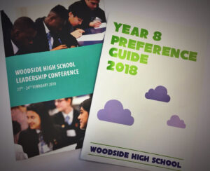 Of course, you could forget lamination completely (particularly if you’re wishing to save as much money as possible) and instead rely on the paper surface to do the work in respect of the surface finish. We can print on matt coated paper, gloss coated paper (not as glossy as lamination but it does have a definite sheen) and silk coated stocks. Silk coated paper is a nice halfway house between matt and gloss, having a pleasant, high quality feel about it.
 Foil blocking
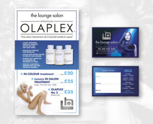
 We also produced a framed version for them to display on their wall inside the salon. This is all part of Southside Print’s large format printing and display service — we don’t only do digital and litho printing.
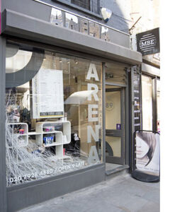 Arena Hair are just a stone’s throw from Southside Print London Bridge, over in Lower Marsh, Waterloo SE1. Call them for a hair appointment on 020 7928 4880 or visit the website at
 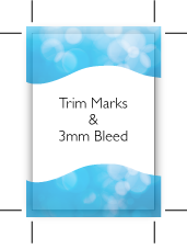 printed job include an extra 3mm of ‘bleed’ (i.e. they extend outside the final cropped document area by that amount). This safeguards against inaccuracies in cutting and ‘page creep’ which occurs in multi-page magazines and books, for example, but let’s not get into detail on that other than to say you do need 3mm of extra bleed for any item printing to the edge of the final job — that is an industry-standard requirement.